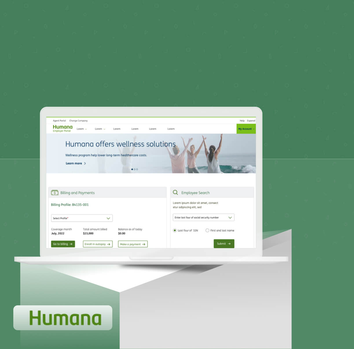
Humana
User Interface, Visual and Interaction design in an Agile/Scrum environment at Humana healthcare.
User Interface, Visual and Interaction design in an Agile/Scrum environment at Humana healthcare.
User Interface Designer
Web
Figma
Invision
Adobe Photoshop
Adobe Illustrator
UI Design
Visual Design
Interaction Design
User base consists of commercial and group Medicare customers and agent partners.
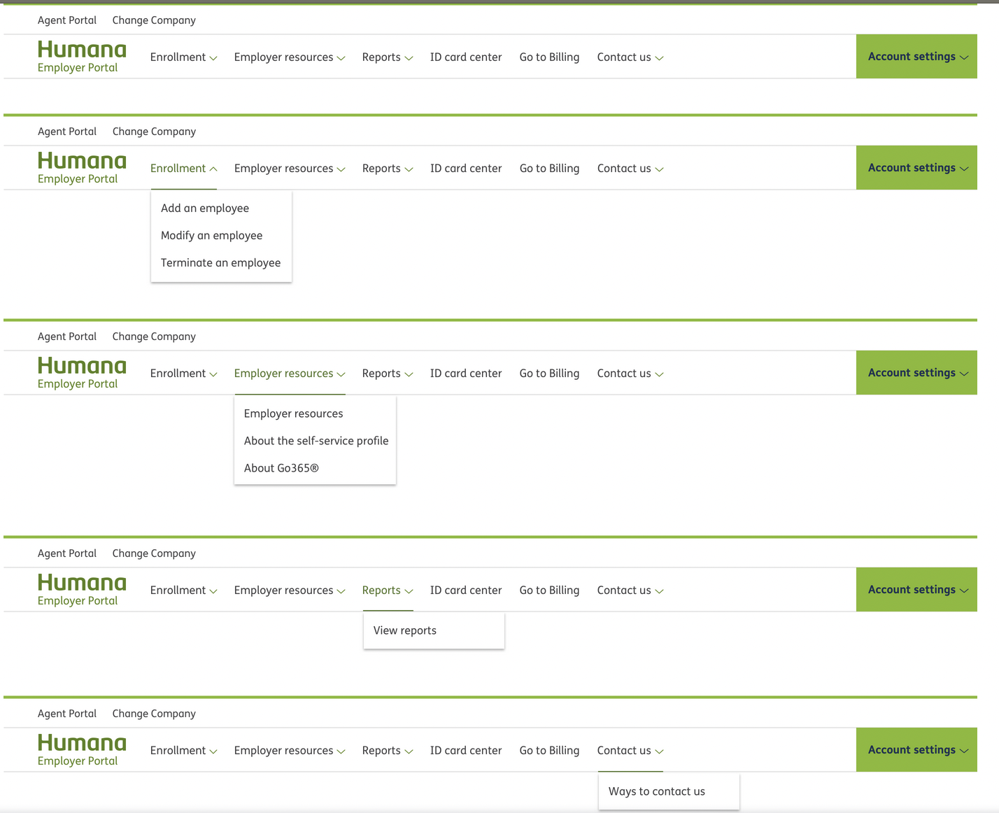
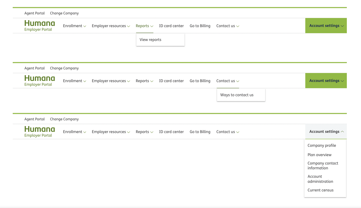
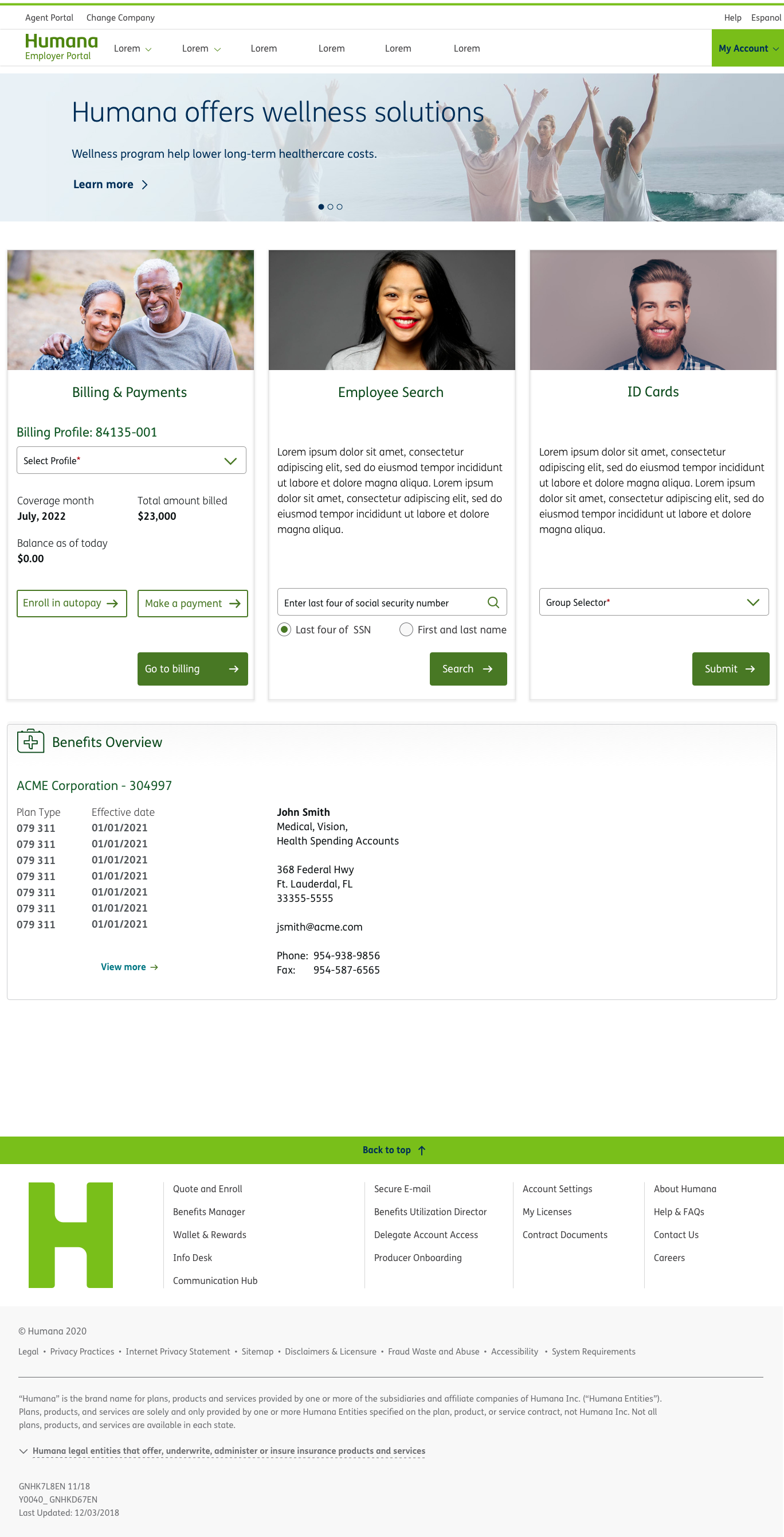
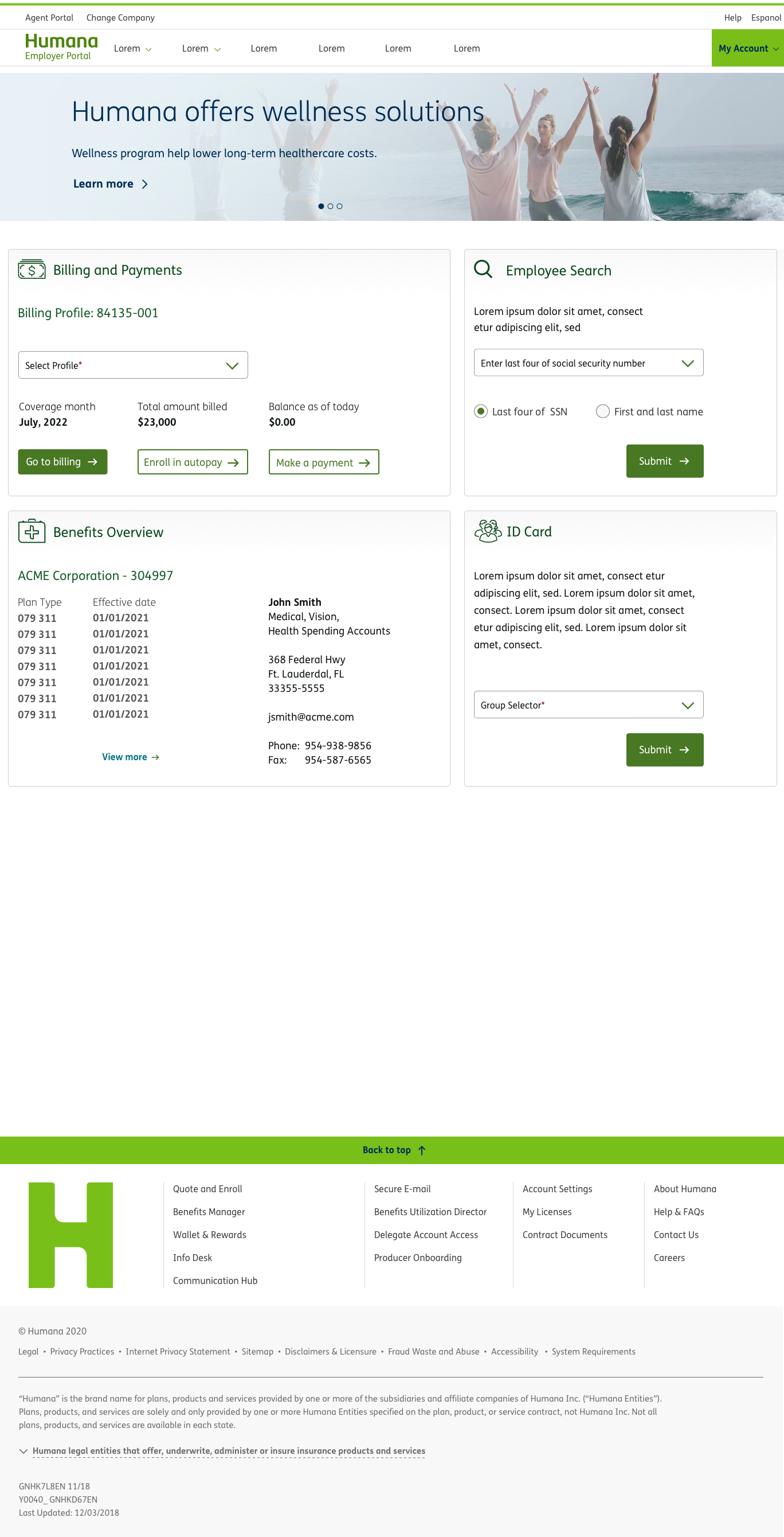
A self service portal experience with a modern platform was needed. Tech stack backed on Salesforce Sales Cloud, with custom Humana brand assets on front-end.
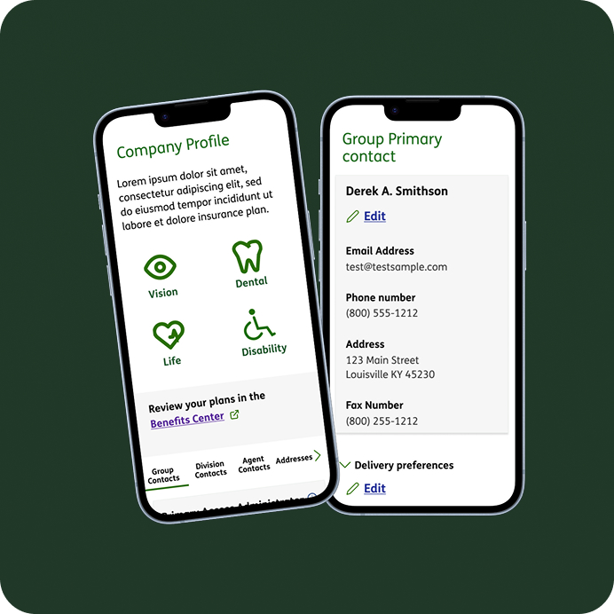
Improved information architecture needed for users to easily find info and perform tasks.
We will use the methods below to propose new information architecture based on the findings.
We start with the existing information architecture and map out the current site structure.
Give participants a series of post-its or ask through a online tool like SurveyMonkey to create headings and rank page titles.
Users are given multiple tasks and asked to click into a prototype to see where they would imagine how to complete these tasks.
We researched to find out what tasks are most important to our users. We can use these to work out the most important tasks.
We identify features, content and functionality that we want the users to consider.
Look up the address of a doctor.
Find office hours of the doctor.
See if they accept your insurance.
For instance, there was a time on a plane where an older gentleman was still on his iPhone after takeoff. The stewart said, "Sir, please turn off your personal electronic device." He didn't realize the stewart meant the iPhone and asked "Why didn't he just say 'iPhone'"? It was a good point, why make things more technical for people than necessary?
Pick 5 - present list of top tasks (hopefully there are a bunch) and have your users identify the ones most important to them in a list sent out from a survey tool like SurveyMonkey for instance.
There will usually be too many tasks for users to consider individually. What happens is the users will scan the tasks and look for key words that are top-of-mind. This is why it is essential to have the list randomized, so tasks have an equal chance of being near the top or bottom of the list.
If you have 10, 20 or so tasks, adjust the number of tasks for them to choose to 3. This makes sure that users only select most important tasks.
Write down all the possible tasks (there could be 20 or 30) and put boxes in front of them all.
Write instructions for the user to select the top 5 tasks/resources from a list that are most important to them.
Instruct them to enter a score of 5 beside the most important, 4 next to next most important,
then a 3, a 2 and a 1. It is important to tell them to fill in only five of the boxes and to leave all the rest blank.
You can calculate the number of votes for each task item and divide that by the total users that participated.
Sort them in descending order and express this as a percentage.
One common question in conducting this is to determine what sample size is needed for good results. A sample size of 100 is generally needed to get meaningful results.
We have run into instances where we didn't have nearly that number as it was hard to recruit testers. So we used as many people internally that were familiar with the tasks to get the numbers up.
Project 2: Visual designer on Longitudinal Health Record (LHR). The LHR is a collection of data products highlighting member data. My involvement is in the visual design of a unique interactive web based timeline view. It unifies data for a cumulative view of a patients entire health journey. There are multiple concentrations of health data on the timeline including Social Determinants of Health (SDOH) and Covid vaccination information displayed.